Why Users Don’t Fill Out the Feedback Form
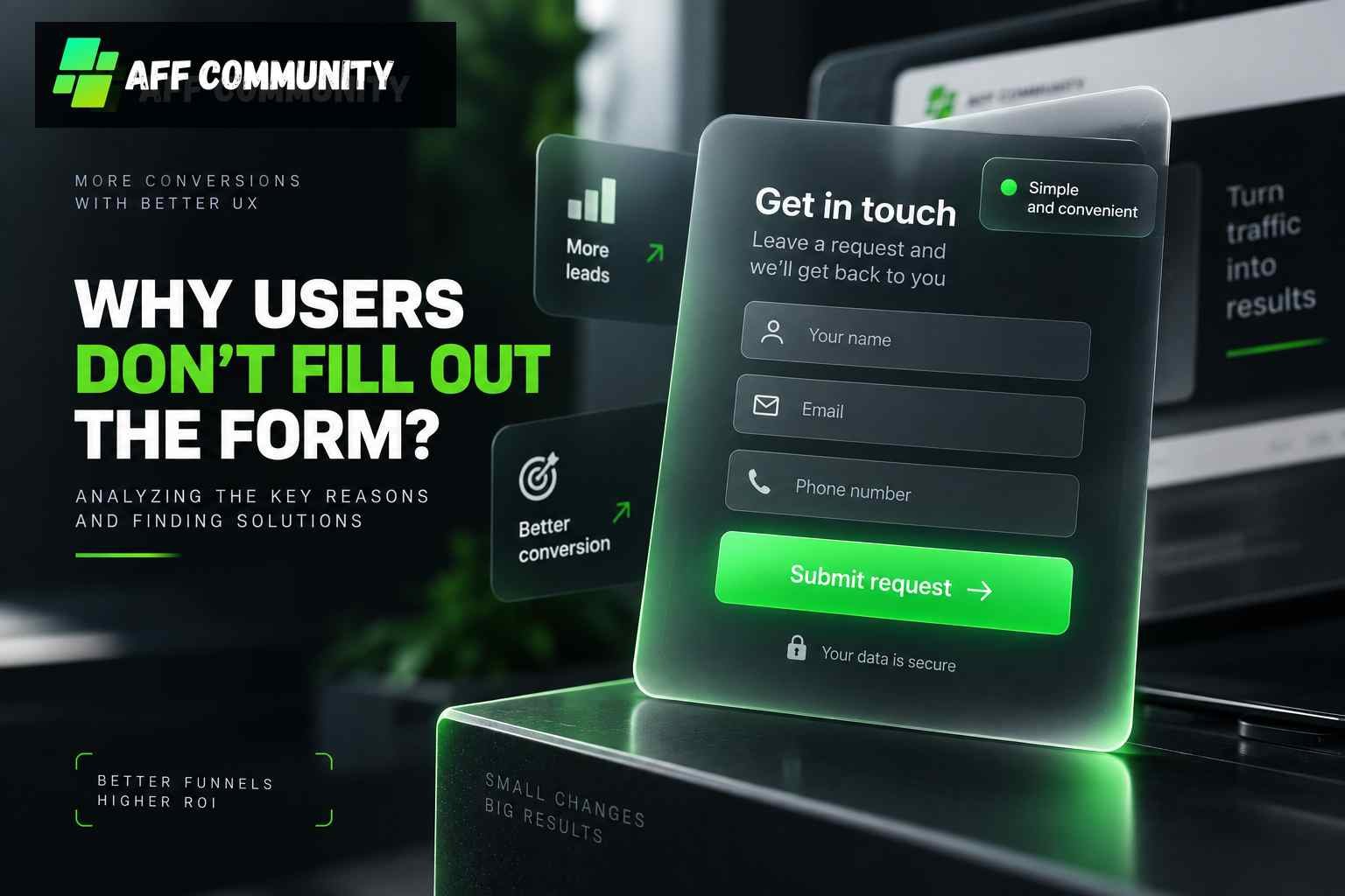
A feedback form seems like one of the simplest elements of a website: a few fields, a button, and a brief prompt to provide contact information. But in practice, this is exactly where you can lose a significant portion of the audience you’ve already attracted.
We regularly encounter situations where ads get clicks, users land on the page, but only a small portion of the audience actually submits the form. And the problem is far from always being the traffic itself.
Let’s break down the main reasons why a user closes the page instead of submitting a form.


A Form That’s Too Long
The first thing to check is the number of fields.
If a person is asked to provide their name, phone number, email, age, city, company, job title, and several other additional details, their willingness to fill out such a form drops sharply.
In the initial stage, you should really only request the information necessary for further lead processing.
All additional details can be obtained later—after the first contact. The less effort required from the user, the lower the psychological barrier to submitting the request.
At the same time, it’s important to look not only at the number of submitted forms but also at the entire funnel. We’ve already covered in detail how to analyze advertising conversion in a separate post.
The user doesn’t understand why they should provide their contact information
Another common mistake is having a “Submit” button without a clear explanation of what happens next.
The user needs to understand what will happen after they fill out the form. Will they get a call? Will they message them on Telegram? Will a quote be sent via email? Will they be given access to the material?
If there’s a sense of uncertainty after submitting their contact information, a person may simply abandon the action.
We recommend explaining the next step right next to the form. For example: “Receive a quote within 10 minutes” or “A manager will contact you to clarify the details.”
This is especially important for cold traffic, where trust in the website is low to begin with.
The form looks untrustworthy
Users are sharing personal data with the company. Therefore, the appearance of the form and the website itself directly affects their willingness to provide their contact information.
If the page looks outdated, contains errors, suspicious pop-ups, or confusing elements, trust drops even before the user interacts with the form.
The same applies to the mobile version. Most advertising traffic may come from smartphones, and a clunky form on a small screen can completely ruin conversion rates.
We recommend reviewing the page through the eyes of an average user: how quickly it loads, whether the offer is clear, and whether the fields and buttons are easy to click.
The Offer Doesn’t Meet Expectations
Sometimes the form works fine, but the problem lies even earlier—in the ad and creative.
A user might visit the site expecting one offer only to see something completely different. In that case, they won’t necessarily try to figure out why there’s a mismatch. Most likely, they’ll just close the page.
That’s why it’s important for the ad, landing page, and form to maintain a consistent message.
It’s also worth considering the quality of the audience itself. Even a perfectly designed form won’t save a campaign if the ad brings in users who aren’t interested in the offer to begin with.
That’s exactly why target audience segmentation remains an important part of optimizing an ad campaign.
Too Slow a Response After Submission
Let’s imagine that a user has filled out the form. That doesn’t necessarily mean the lead will be high-quality.
If a person doesn’t receive a response for a long time after submitting the form, their interest quickly wanes. During that time, they might find a competitor, change their mind, or simply forget about their inquiry.
We recommend minimizing the time between form submission and the first point of contact as much as possible. Even an automated message confirming that the request has been received and that a specialist will contact the user shortly helps reduce uncertainty.
At the same time, how you handle the lead afterward also affects the final conversion rate. In our article on optimizing traffic handling and increasing conversions, we discussed response speed, communication scenarios, and other stages of the process.
No testing of different options
It’s impossible to know in advance which form will be optimal for a specific audience.
We can assume that a short form will work better than a long one, but only data provides the real answer. Therefore, it makes sense to test different options:
- the number of fields;
- the text next to the form;
- the button copy;
- the form’s placement;
- the call to action;
- additional trust-building elements.
When analyzing results, don’t focus solely on the number of submissions. It’s important to consider the cost per lead, its quality, and the long-term outcome.
To do this, it’s helpful to evaluate key advertising campaign metrics rather than making decisions based on a single number.
Sometimes the problem isn’t the form at all
If there are few submissions, don’t immediately change the button or remove half the fields.
We recommend going through the entire funnel: ad → click → landing page → form → submission → lead processing.
If the CTR is good but users aren’t reaching the form, the problem may lie with the landing page or the offer. If the form is being filled out but there are few high-quality leads, it’s time to examine the audience and the subsequent lead processing.
In addition, you need to track duplicate submissions and duplicates. This is especially important when working with lead forms on advertising platforms.
Conclusion
A low conversion rate for a contact form is rarely due to a single cause. Most often, several factors are at play simultaneously: too many fields, a weak offer, a lack of trust, an inconvenient mobile version, or slow request processing.
We recommend not trying to guess what exactly is holding the user back, but rather examining the data for each stage of the funnel and systematically testing changes.
Sometimes, simply removing a couple of unnecessary fields or changing the text next to the button is enough to achieve a noticeable increase in conversion rates. The key is to first identify the specific point where the user stops moving forward.